Unveiling the New Look: Discover the Changes in Google Chrome’s Material You Redesign!
In celebration of its 15th anniversary, Google Chrome will undergo a makeover, according to an announcement made by Google. The redesign will feature a new appearance and additional features. Chrome will now adopt the Material You theme, previously introduced in Android, resulting in rounded corners, updated icons, and the removal of the lock icon from the address bar. This marks the first redesign for the browser in 5 years, with its previous makeover occurring in 2018 when it transitioned to the Google Material Theme.
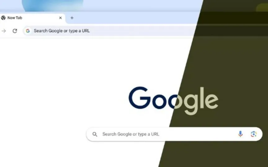
Announcing the new redesign, Google said in a blog post: “In the coming weeks, Chrome will be getting a new look for desktops. Based on our Material You design language, we’ve updated Chrome’s icons with a focus on readability and created new color palettes that better complement your tabs and toolbars. These new themes and different colors can help you differentiate your profiles, like work and personal accounts, at a glance.We’ve also better integrated with operating systems so your Chrome settings can easily adapt to OS-level settings like dark and light modes.
Google Chrome gets a new design
It’s worth noting that even though it’s a redesign, the look and feel of Google Chrome is still the same, so it doesn’t feel like a new browser. However, you’ll notice that there’s a drop-down menu on the far left that shows all open tabs as well as recently closed tabs. The appearance of the horizontal tabs at the top of the window has also changed. They now appear as little pills when you hover over them, with just a white line separating the tabs.
You will notice that the corners of the icons and appearance are more rounded and the browser feels taller. One big change is that the omnibox (address bar and search field) now doesn’t show the lock icon indicating https protection. Google previously said that since most websites support https today, it’s an unnecessary icon. It has been replaced by a settings icon that displays menu options for connection security, page permissions, cookies, and site information.
Outline-style icons with a hollow interior are another addition you’ll see. You also get Material You color palettes that bring you really bright and pastel options.
Your bookmarks, reading list and history are also quickly accessible via the side panel icon next to your profile icon. The history here is organized categorically instead of chronologically, which means that you can see all the pages opened with a specific keyword. This makes it easier to both search for pages and delete the topic’s history.
The rollout has already started, and if you haven’t already, you should be getting it in the next few days.


