Fitbit App Set for Major Redesign – Here’s What to Expect
Fitbit users may soon witness significant changes in the app as Google plans to initiate a redesign later this year. This revamp aims to completely transform the app’s appearance and user experience, while also introducing new features. In recent months, the app has undergone numerous modifications, and now users can anticipate an entirely new app following the redesign. According to reports, a select group of users have already been invited to test the beta version of the current app.
Let’s see what all the changes are expected in the new Fitbit app.
Expected changes to the Fitbit app
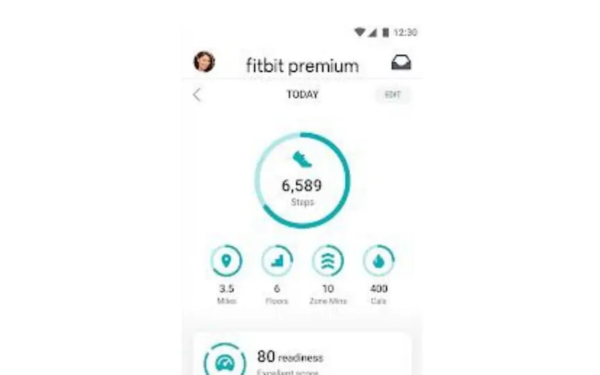
According to a report by The Verge, the Fitbit app may be getting an updated version of how to display the device’s tracked data. It is noted that the application is divided into three tabs, consisting of the Today, Coach and You tabs. There are no major changes in the Today tab. However, top-level metrics can be customized, allowing you to focus on specific areas of interest. The report explains that if your goal is to improve heart health, the app emphasizes heart health metrics, zone minutes, and exercise.
According to Fitbit (via The Verge ), “The new tab features more consistent charts, graphs and icons that show health trends.”
As for the Trainer tab, this tab consists of health and fitness content. On the tab, users can browse a curated list of exercises and mindfulness sessions. Free app users have limited content, but premium members can enjoy more exclusive fitness content.
The You tab allows users to manage their personal settings such as daily goals, steps, bedtime and more. This tab also features revamped achievement badges such as user progress and reports.
In addition to the new tabs, the app also features a new color palette, icons, photos, and more to match Google’s Material You design standards.
The user interface is also rumored to match the leaked Pixel Watch 2 watch faces. So it can be argued that the Fitbit app is likely to have a Pixel-like design.


