Google Maps’ Color Coding: Too Cold for Comfort?
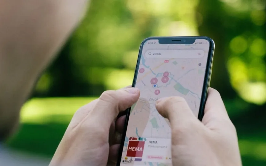
If you have used Google Maps recently, you may have noticed that the colors of the interface have changed, in fact they look quite cold. And you are not alone in observing these changes. Google Maps has received a new update that includes changes to the colors of roads, water, land and more.
The next time you browse the app, you’ll notice that the roads are now gray, the water color in Maps is now teal instead of blue, and even the parks and forests have been recolored. You will also notice that the navigation traffic colors are now brighter red and blue, which was not the case a few days ago. All of these changes have clearly not gone down well with users, who now feel that these colors make Apple Maps look much better, even though Google still has the upper hand today in terms of features.
But the most startling downvote comes from Elizabeth Larak, who helped design the Google Maps user interface in 2007 when the product was about to launch. In his post this week, Laraki pointed out that the changes to Google Maps make it less human, less accurate and cold. Even the parks and water color are identical, which may not be a problem, but certainly not a well-versed UI decision from the Maps team handling these changes.
15 years ago, I helped design Google Maps.I still use it everyday.
Last week, the team dramatically changed the map’s visual design.
I don’t love it.
It feels colder, less accurate and less human.
But more importantly, they missed a key opportunity to… pic.twitter.com/HMcpKiOEdr
— Elizabeth Laraki (@elizlaraki) November 22, 2023
He admits that brightening main roads and traffic makes it easier to read, but general changes have been criticized and it is likely that such radical changes will take time for people, and gradually they may come to like, or at least accept, new color shades.
Laraki also mentioned the need to simplify Maps’ user interface instead of suffocating the screen with numerous services that users may not need all the time. He said tags such as restaurant, hotels and service station (gas pump) can be packed into a bottom bar whose features can be hidden from the main Maps screen.
He agrees that features will evolve over time, but as a UI designer, he understands that they need to be cleaned up regularly and not make the app and UI more difficult for users. People in countries like the US have actually jumped onto Apple Maps, something that might have been impossible a few years ago.
For Indians, they have options like MapMyIndia, which seems to optimize the platform for local needs, such as helping people climb an overpass or flyover, and helping them on roads that may be closed or barricaded.

