Google Gives Android Logo and Bugdroid a Makeover to ‘Complement’ Brand
Google’s Android operating system is famous for its quirky marketing and iconic green bugdroid robot. The operating system’s branding has changed a few times over the years, and will change again in 2023 to “better” represent the Android community.
Google says that the Android brand has been updated a few times to modernize the look and feel. In 2019, they simplified the Android wordmark and got rid of desert naming conventions like Android Lollipop and Oreo.

“Every time we renew our brand, we evaluate not only changing needs but also future goals. We know people today want more choice and autonomy, and we want our brand to reflect Android: something that gives people the freedom to create on their own terms. As an open platform, it’s important that both our technology and our brand invite people to create, connect and do more with Google on Android devices,” Google said.
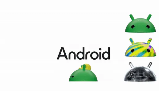
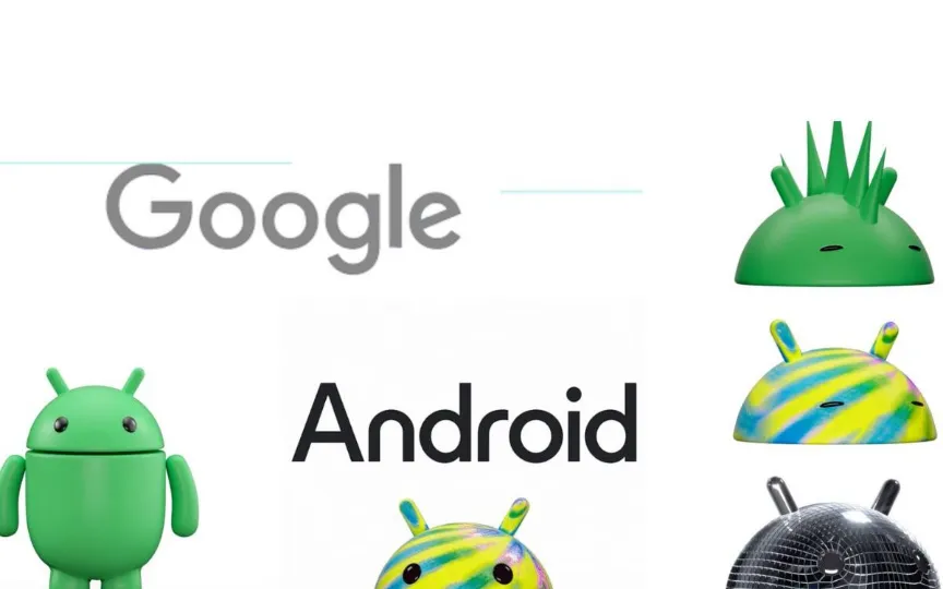
Additionally, Google says its new design language draws from Material Design to “complement Google’s brand palette.” And Google added that this update appears to help better connect Android with Google, as “departing from our old style of lowercase ‘android’,” we’re elevating the Android logo with an uppercase “A,” which increases its appearance when placed. next to the Google logo.” According to the company, these changes help the Android logo more closely reflect the Google logo.
The Android bugdroid is also getting a 3D makeover. It now shows “more dimension and a lot more character”. And Google notes that it’s “a visual signature of our brand,” so it wanted the bugdroid to look “as dynamic as Android itself.” In addition, Google has also made full-body changes to the structure of the bugdroid to better suit both digital and real environments.
These changes should start appearing on all Google domains starting this year.


