Your Spotify feed will soon have a TikTok-like swiping avatar: All the details
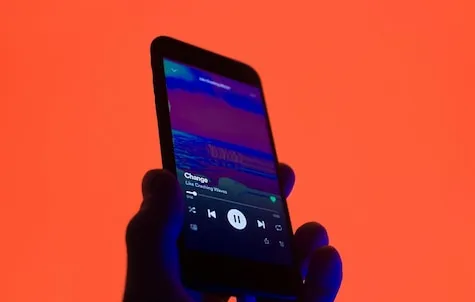
Spotify is ready to look different on your phone screen in the coming days, and the user interface will be stylized like TikTok. Vertical videos have become the preferred choice of most smartphone users and recent trends suggest that everyone wants a piece of the vertical era.
For a music streaming app, vertical feeds don’t make sense, but when you look at the evolution of user interfaces across platforms, Spotify was always going to fall in line with user demands. The swiping generation has become addicted to these platforms, and Spotify hopes to attract more users and get them to pay for its music services. It is available to all Spotify users (both free and paid) on Android and iOS devices.
Music playlists keep changing when you tap a button, similar to how you get Stories on different social media apps. You can also swipe up to stream the next song or get another playlist of your choice.
The bottom of the app doesn’t change, and you still have Home, Search, and My Library settings. Spotify also wants more people to enjoy music content in video format, so just swipe up and watch videos like how you do with Reels and TikTok. So why the change? Spotify says its data suggests people want to preview content before becoming fans of artists and groups.
But it’s not just about the new interface, as Spotify now claims to have 205 million paid subscribers, and we’re pretty sure India isn’t a significant part of that group. The platform also makes it easy to find podcasts, new music and audiobooks. You can save, share and explore artists.
Discovery is also being revamped to give you better search results. Discover new songs and share them with friends. Spotify is also bringing the Discover DJ feature to select users, a smart shuffle feature for better personalized content, and autoplay for podcasts.
Read all the Latest Tech News here.


