iPadOS 17: Enhanced Multitasking for Power Users
Apple made a significant software update for the iPad last year with the introduction of iPadOS 16. This update included Stage Manager, a completely redesigned multitasking mode that allowed users to have overlapping and resizable windows on their iPads. Additionally, the update offered enhanced support for external displays, as long as the hardware was compatible.
There were many other new features as usual, but Stage Manager in particular brought the iPad closer than ever to a Mac or Windows PC experience. iPadOS 17, on the other hand, is a more subtle update. This is usually the case when one year brings big new features and the next offers improvements and stability improvements. And while iPadOS 17 doesn’t have a single headline feature, the myriad of smaller changes certainly add up. I’ve been using the iPadOS 17 beta for a few weeks, and now that the public beta is underway, you can do the same.
A note about stability: Although this is a public beta, the “beta” is still valid. It’s probably not ideal to install on a machine you rely on for daily use, as you’re bound to run into errors and crashes. And it’s always a little confusing how well third-party apps work in beta. Overall, I haven’t come across anything particularly serious. Sometimes the app just throws me back to the home screen, or you might find weird UI issues where apps aren’t fully optimized yet. But over the past few years, Apple has gained a reputation for releasing public betas in solid, usable spaces, and that’s the case here. Just remember that “downgrading” to the final releases of iPadOS 16 is not exactly a simple process.
Stage Manager updates
While Stage Manager opened up some significant new multitasking features for the iPad, it was also much more rigid than the Windows management system you’d find on a Mac. This year, Apple has tweaked things to make it easier to define your ideal workspace. Previously, apps would fit into a handful of predetermined sizes to fit your screen, and the placement of each individual window was up to iPadOS. Application windows now have much more detailed information regarding their size and placement. For example, I can make the Notes app I’m typing in right now a small window that’s half the height of the screen and about a quarter of its width. From there I can make it as tall or as wide as I want; there are still certain sizes it fits, but there’s a lot more flexibility than last year.
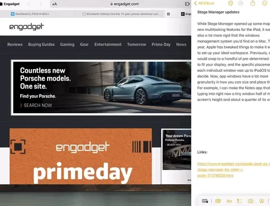
iPadOS 17 is also much more flexible in organizing multiple apps, which was not the case last year. When you added another app to the space, iPadOS automatically decided where the two windows should go. You can resize both to your liking, but it was basically impossible to display two apps side by side without overlapping. This is no longer the case. Now it’s simple to grab the top of the window and drop it where you want.
These basic controls have been available on Windows and macOS for decades, but it’s still a new paradigm for the iPad. I’m really glad that Apple seems to trust its users more by giving them more flexibility instead of letting iPadOS make big decisions about screen layout. Stage Manager is still a bit of a niche feature as not many iPads can use it, but people who want to push their iPad further will definitely appreciate these updates.
Lock screen and interactive widgets
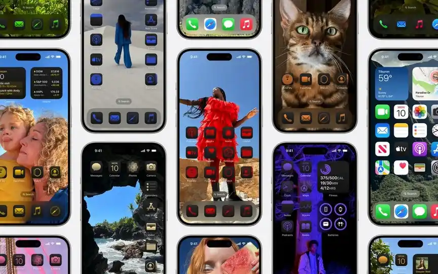
Probably the most obvious user-facing update is the redesigned lock screen. It should also be very familiar since Apple first introduced it on the iPhone a year ago. Basically, you can now set up multiple lock screens, each with its own wallpaper, widgets, and design elements (like fonts and color filters). You can switch between the styles you’ve set by pressing and holding the lock screen, then selecting the one that suits you. Finally, you can also set a specific focus setting for each lock screen to set up the entire profile for work mode or vacation time.
There’s also a cool new wallpaper picker – this too is borrowed from the iPhone. However, there are some new styles specifically for the iPad, including stunning views of every planet in the solar system. And as a nod to iPad history, they brought back the original Pyramid Lake wallpaper (photographed by Richard Misrach) from the first iPad in 2010. I like nostalgia and I love photography, so Apple won me over here. .
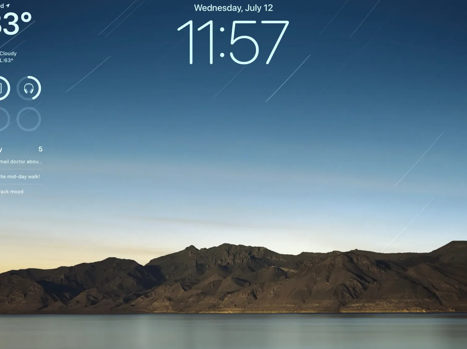
Beyond aesthetics, widgets on the lock screen make the iPad’s big screen more useful—there’s a lot of room, so why not show more than just the time and your notifications? But widgets are getting big improvements beyond being able to drop them onto the lock screen. Finally, they are interactive. This means that if you have the Reminders widget, you can tap on a specific item to check it without having to open the app. Or with the Apple Music widget, you can automatically start playing an album or playlist.
Widgets used to let you tap certain parts to go to that place in the app, so they weren’t just static information displays, but this takes their functionality much further. We’ll need third-party developers to add this functionality to their widgets to really take full advantage of the feature, but I’m looking forward to seeing how apps incorporate it once iPadOS 17 is out in the wild.
Health
There aren’t many Apple apps on the iPhone that you can’t also get on the iPad. Health was one, but that has been fixed this year. It’s exactly what you’ve been waiting for: Tracked health data from your iPhone and Apple Watch is available on the iPad, which is designed better for a larger screen. While there’s nothing revolutionary here, the Health app can contain so much data that it’s actually easier to dig through everything here.
Everything syncs from your iPhone, but so far the syncing process hasn’t been the most reliable. Although the Health app on my iPad says it synced two minutes ago, it hasn’t pulled updated step data since 7am. My activity rings from my Apple Watch are also hours out of date. My guess is that this will be resolved before iPadOS 17 is ready.
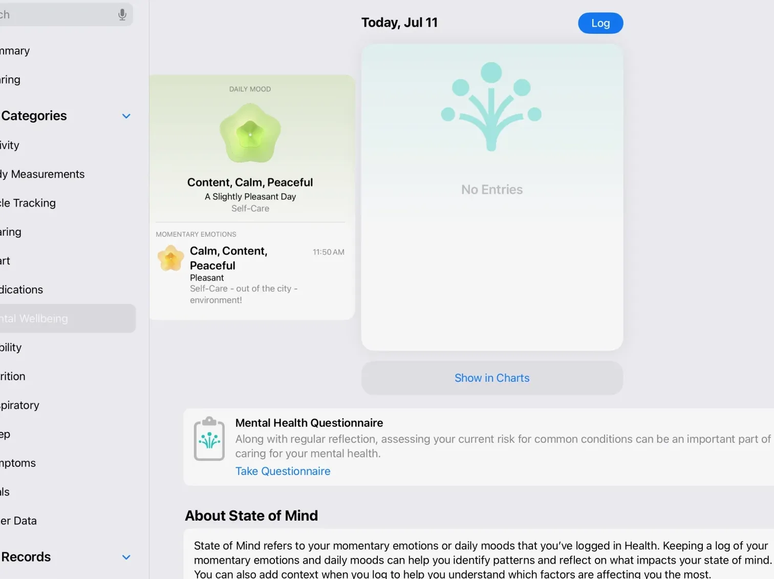
Apple announced a handful of mental health features as part of its latest iPad and iOS updates, including its own diary app and mood trackers in the Health app. While the magazine app isn’t coming until “later this year,” sometime after the official release of iPadOS 17 and iOS 17, mood tracking features will be available in the Health app. I’ve long been in the habit of tracking my daily mood, and this isn’t a bad place to do it. It’s pretty simple, with a slider to choose your general mood and a few follow-up questions, but the idea is that it’s quick and painless, so you’ll be doing it repeatedly. You can also take a mental health questionnaire that claims to assess your level of anxiety and depression, which reminds me of questions I’ve answered in the past from a doctor. I reached out to Apple to find out where they sourced this question from so we can learn more about their qualifications and approach.
Safari, Messages, Notes and more
As always, Apple’s core apps get lots of small but potentially meaningful updates. Safari’s biggest new feature is undoubtedly the ability to set up multiple profiles. Each profile can access all of your bookmarks, saved passwords, and reading lists, but keeps logins to sites and tab groups separate, for example. I created basic “person and work” profiles and logins to work-specific tools were kept separate. It’s also pretty easy to move things between profiles if you accidentally open windows in your personal profile that you prefer with work tabs. And of course this all syncs via iCloud to other devices – I also have macOS Sonoma beta installed and things shared seamlessly.
Messages is perhaps Apple’s most important app, and it gets usability improvements and new features every year. A bunch of them are focused on voicemails, which I haven’t really had a chance to check much. However, I like that replying to the thread is much easier than before. Now, swiping right on a message opens the reply interface, which is definitely faster than holding down the message, waiting for the menu to pop up, and selecting the “reply” option.
The search experience has also been updated with filters. For example, you can first search for a specific contact and then search for keywords only in his conversation. The results will naturally include specific posts as well as relevant links, images and more.
But the update I’ve had the most fun with so far is definitely the stickers. You can now easily create your own stickers from images in your photo gallery. If you tap an object in the photo, you can drag it out of the background and save it as a sticker for easy reuse. Live photos can be turned into live stickers – and let me tell you, the live sticker I made of my lying dog is cute and I’m spamming everyone with it.
Your own stickers can live alongside sticker packs, emojis and memos from other apps. And the stickers you create are also available in third-party apps. Basically, the stickers and app stickers you create should be easier to share outside of just Apple’s Messages app, which is a nice change from Apple’s previously aloof approach.
Notes, quietly one of Apple’s most useful apps, has also received more improvements this year. You can now embed PDFs directly into a Notes document and they will appear full-width, so you can easily browse and annotate PDFs below. You can also, of course, annotate it with Apple Pencil or collaborate with others in a shared note.
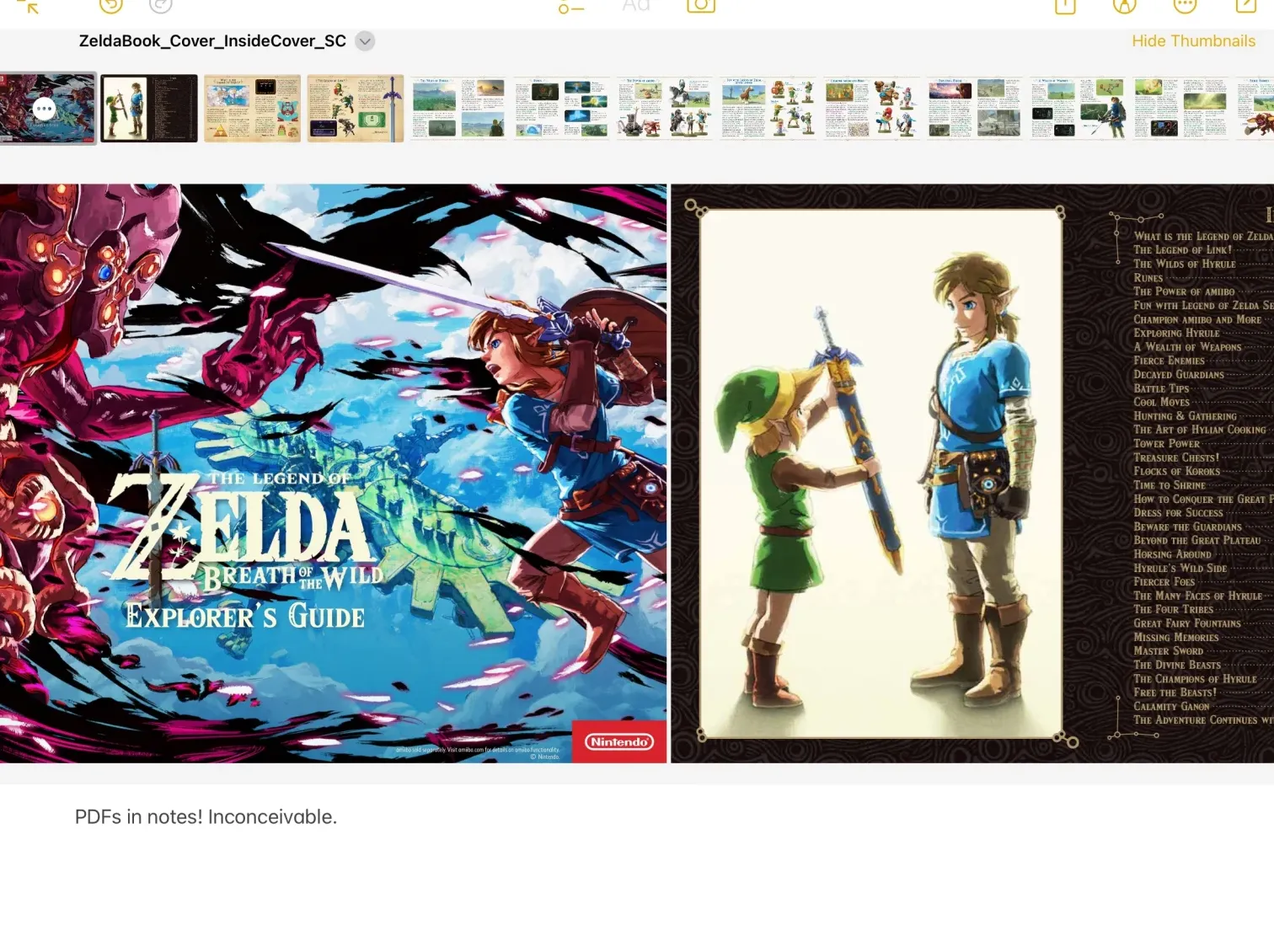
System-wide PDF support has been improved. For example, opening a PDF document from the Files app will open it in its own window if you’re using Stage Manager. This makes it easy to side-load a PDF file with another app while still having full access to the Files app. The automatic filling of fields in PDF files has also been improved throughout the system; Apple says it uses an on-device neural network to recognize documents with fillable fields system-wide, and you can automatically fill in information like names and addresses, just like on websites.
Another useful trick is the ability to link directly to a specific note in your library. Other note-taking apps like Bear have had this feature for a while, but it’s undeniably handy to link related notes together so you can easily jump between them instead of having to go back to the sidebar to find what you’re looking for. .
The rest
This only scratches the surface of iPadOS 17. Many new features, such as changes to Messages, work best when other people you know are also using the new software. And other things like the diary app can’t be tried for months to come. Finally, iOS 17 has a lot of features like Facetime updates and a smarter keyboard is also in iPadOS 17. If you want to try all this out months before Apple finalizes everything, you can install the iPadOS 17 public beta now. But as always, think carefully about whether you’re ready for volatility before you take the plunge.


