Vizio’s Updated TV Interface Streamlines Show Searching
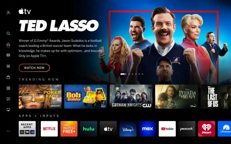
Vizio is giving its TV interface a fresh look to address any feelings of stagnation. The company is introducing a revamped home screen that aims to enhance content discovery. The redesign focuses on improving user-friendliness by introducing new navigation features, menus, and settings. Additionally, an updated on-screen keyboard has been implemented to facilitate quicker searches.
Discovery is also an important focus. The updated home screen includes recommendations as well as parental guidance and Rotten Tomatoes scores. Genre pages help you get to know a certain category faster. There’s also more customization with a personalized “app bar” that lets you mark favorites with a single remote click. You get app-specific recommendations, and the My Watchlist section contains movies and shows from several apps.
Vizio has not said which TV models will get the new home screen or when the rollout will be complete. We have asked the company for more information. There’s no guarantee that older sets will get an update, but you may not need to buy new hardware.
Interface upgrades aren’t new to TVs, but the industry tends to limit major upgrades to new or new TVs. LG did not bring webOS 4 in 2018 to webOS 3 TVs released only a year earlier, for example. If Vizio ships a new home screen for more than the latest series, it offers better aftermarket support than some of its larger competitors.


