Shazam’s iOS interface has just been revamped and there is also a web beta.
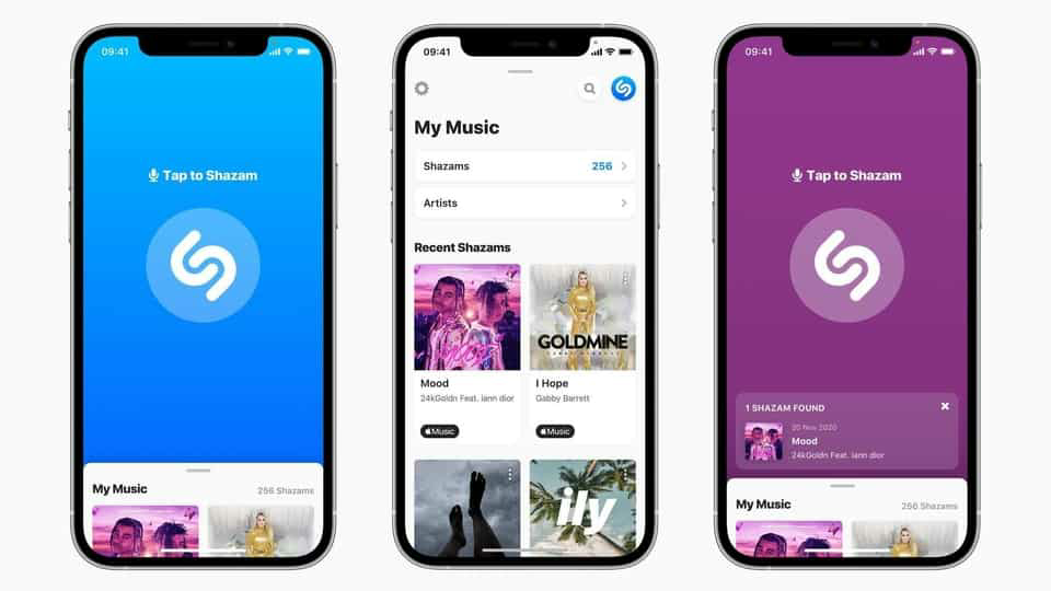
Apple has revamped the Shazam app on iOS with a new modern look and a design language in line with recent UI updates on Apple Music.
Now, when you launch the app on the iPhone, the screen is dominated by the center button, Shazam’s tap, with access to recently tagged music that can be viewed by swiping up. Apple has also added the ability to identify songs through the web browser for the very first time, which is available in beta at shazam.com.
Apple announced last month that Shazam saw more than 200 million monthly active users on iOS and Android. And in case you don’t remember, Apple acquired Shazam in 2017 for synergies with its music business .
The new Shazam UI makes the app look more comfortable with the latest iOS design trends, but it continues to have some of the cross-platform “quirks” like the vertical three-dot button for “More” and a Android paradigm.
The main task Shazam needs to do, which is identifying a song, has been prioritized with access to the previously Shazamed tracks that are in the drop-down drawer at the bottom of the home screen. The update also increased the reliability of syncing Shazam tracks with Apple Music or Spotify.
Shazam song identification is now also available on the web at shazam.com. Users simply need to go to the website to access Shazam tracks on the web browser and it launches in beta for now and is currently compatible with Chrome, Firefox, and Safari on macOS and Chrome OS.


