Exploring Google’s Design Philosophy Behind the Pixel Foldable Phone
Samsung has dominated the market for large smartphones with flexible screens since the launch of the original Galaxy Fold in 2019. However, Google is set to challenge this monopoly with the upcoming release of the Pixel Fold later this month. Despite Samsung’s four generations of foldable flagship phones, Google cannot simply copy their design. In an interview with two of Google’s product managers, George Hwang and Andrea Zvinakis, they discussed why the Pixel Fold is being released now, what sets it apart, and how it will influence future devices.
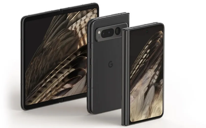
The first thing I noticed during hands-on was the shape of the Pixel Fold. Instead of a long and thin stick-like body like the Galaxy Z Fold 4, Google opted for a wider frame that was more passport-shaped, which was a deliberate decision by Google. Hwang, who is the PM of the Pixel Fold team, told me that “when we talk about the Pixel Fold, we often talk about the external display first.”
Hwang says the reason for this is that more than 50 percent of people’s interactions with their phones take less than two minutes — for example, texting a friend, changing a song, or simply setting an alarm. “We focus on the form factor critically and quite deliberately to make sure we provide a usable external display so you can use the phone the way you want.”
While using the Pixel Fold’s external display like a regular phone might sound obvious, it was also a bit of a surprise. Typically, when people discuss foldables, much of the attention is devoted to that sleek flexible screen inside. But more importantly, it touches on a few of Google’s overall design goals for the Pixel Fold: Being able to use it like a regular handset, even if you’re just wearing it closed, allowing users to open the fold to enhance their experience, and then making sure that even though it’s a larger device, it’s still a viable daily driver.
When it comes to using that large internal display to enhance the device’s capabilities, it feels like much of the Pixel Fold’s potential lies in the marriage of hardware and software. As a member of Google’s Android platform team, Zvinakis stressed the importance of the Pixel Fold’s continuity and positioning. “If we were only designing for tablets, you can only create one large screen,” he said, “whereas foldables are often opened to continue the session.”
When designing an app or user interface for a foldable device, Google needs to consider things like buttons or other elements that could fall into the creases of the Pixel Fold. But it also means you can unlock the device without losing your place, which often feels like a difficult goal. But when it works, it offers an instant sense of adaptability that you just can’t get from a traditional phone.
Continuity also affects position, which is the position of the phone’s screen from open to close and every angle in between. Thanks to the flexible design of the Pixel Fold, Google not only has to follow the direction of the device, but it is important to anticipate how the phone’s cameras and user interface will adapt and move and behave according to its position. “We want unlocking the device to be useful to the user, rather than just seeing the wider layout of the phone,” Zvinakis said. “That’s why we created, for example, a double shader for notifications that utilizes both sides of the screen.”
But even more exciting is how Zvinakis says posture sensing could open up entirely new use cases, like the Pixel Fold’s dual-screen interpreter mode. This allows users to position the phone so that two people can see a different language being translated in real-time—each with their own screen—reducing the typical back-and-forth when everyone has to share one screen. And while we’ve seen some other new uses for foldable phones, like taking high-res selfies with the rear camera on the phone’s outer screen, there’s more and more functionality available that you simply can’t get with a traditional phone. glass brick.
There are other elements that are needed for foldable products to reach their true potential. Take the Fold’s taskbar, for example, which needs to straddle the line between enabling short mobile interactions and more complex multitasking situations. “We released the taskbar with Android 12L in March of last year, and the first version was basically a pinned taskbar that you had to long press to hide and long press to show,” Zvinakis said. “But when we did more testing, users said they found this behavior a bit clunky. Instead, we honed it into a more transient taskbar where you can use it with a short swipe, drag any app onto the split screen, and then it automatically closes when you’re not using it.”
The big challenge is to combine competing design elements, such as the thinness of the device, while still supporting advanced components such as the phone’s 5x optical zoom. So to get over that hump, Hwang challenged the team to make a device that was more than just a collection of components: “If you don’t want to use it every day, it’s not the device we want to ship.”
The pursuit of thinness is much more important for foldable phones than for other phones. “We realized that if this thing was thick and big, it’s not something you really want to keep in your pocket all day,” Hwang said. “I think the thing that was key was the hinge. How the hinge is architected drives everything around the foldable screen. It’s kind of symbiotic.”
This was somewhat of an unexpected revelation because as an owner of several generations of the Galaxy Z Fold series, I thought the hinge issues had been resolved after all the issues with the original model. “What you see in most foldings is that you have hinge mechanisms along the length of the hinge in three to four different places,” Hwang said. “But now, with the hinge components in the middle of the device, it controls the thickness of the stack, and then the display is on.”
So Hwang thought, “if these are the limiting factors, can we creatively move those components somewhere else?” So in the end, the Pixel Fold team moved the phone’s two hinges to the edge of the device and lifted it out of the plane, which had several important implications. Not only does this reduce thickness, he says, “it also helps drive the biggest gap between the outer 5.8-inch screen and the inner 7.6-inch flexible inner screen.” In addition to this, Google’s architecture helped address what Hwang calls folding geometry, which describes how the screen actually bends inside the hinge. “The hinge allows us to turn the screen inward, which allows the fold to extend into that area and further reduce the thinness,” he added. And while I’ve only used the Pixel Fold briefly so far, the result is pretty impressive, as Google manages to make a phone that folds completely flat while still being less than 6mm thick (or just 12.1mm when closed).
Pixel Fold’s hinge-like steps forward and thinness don’t come without compromises. But even though its bezels are somewhat larger than Samsung’s, for Hwang it’s worth it. “The frame allowed us to get an unadulterated display without having a camera under the display, which we thought was really cool.” It also gave Google more leeway to improve the overall durability of the Pixel Fold, which includes an IPX8 rating for water resistance. “Also, it has ergonomics, and the larger screen bezels provide a resting area for your hands,” he said.
Hwang said dealing with the inevitable creasing of the Pixel Fold’s screen was another balancing act he still thinks about regularly. “It’s not attractive, but the bigger question is, how do you soften the wrinkle? How do you minimize it?” In the end, Google settled on a hybrid approach that produces a crease that’s more of a miniature water drop running the length of the screen instead of a full crease, reducing its appearance while preventing unsightly dimples from forming over time.
Still, as impressive as the Pixel Fold’s design is, from talking to Google’s product managers, I get the sense that it has an even more important role, serving as an ambassador for future folding devices and a flag-bearer for Android’s forward-looking software features, along with new optimized ones. applications. That’s because, in addition to the device itself, the Pixel Fold also brings new resources to help app creators optimize their work. Zvinakis said, “The most important way to do this is through developer guidelines, developer tools, and easy-to-use libraries.” These things dictate support for features like adaptive resolution, horizontal orientation, multitasking behavior, and more. There are even separate levels showing how much the developer has done to support foldable features, as well as sample configurations available in the Android Studio emulation environment. “We’re going to launch physical device streaming to these Google devices in Android Studio, which basically means developers can see how their apps work on Google-hosted Pixel Fold and Pixel Tablet devices, but directly from your IDE (integrated developer environment). . We want just to make it really easy for developers to test these new products.”
To make sure it’s easier for users to find these apps, Zvinakis says Google is starting to feature “really high-quality apps more prominently in the Play Store, including screenshots that show off the new foldable features.” And all of this comes with more than 50 first-party Google apps optimized for folding, which both Hwang and Zvinakis said was no easy feat. In this way, the Pixel Fold not only serves as a test bed for future devices, but also for Google’s evolving software design.
Unfortunately, the team behind the Pixel Fold hasn’t been able to overcome all the hurdles that might stop someone from jumping on the flexible phone trend — especially at its $1,800 price tag. But even though the Fold is the company’s first in the category, it’s clear that Google is bringing a lot of new ideas to the space, both in terms of hardware and software. It’s slim, sleek, and unlike the Z Fold 4, the Pixel Fold offers the same amazing camera experience as the Pixel 7 Pro. How well it sells remains to be seen, but with Samsung’s Z Fold basically treading water over the past couple of years, the arrival of the Pixel Fold couldn’t come at a better time.


